On Site Design controls how Try On looks and feels on your storefront—colors, imagery, copy, and related experience options. You manage it from the Antla admin, not from Liquid pop-up settings in your theme.
Open Shopify admin → Apps → Antla.
Go to On Site Design.
Adjust settings and save.
Changes apply through Antla’s extension settings / store metafields that the theme embed reads. You do not need to edit theme Liquid to restyle the try-on experience.
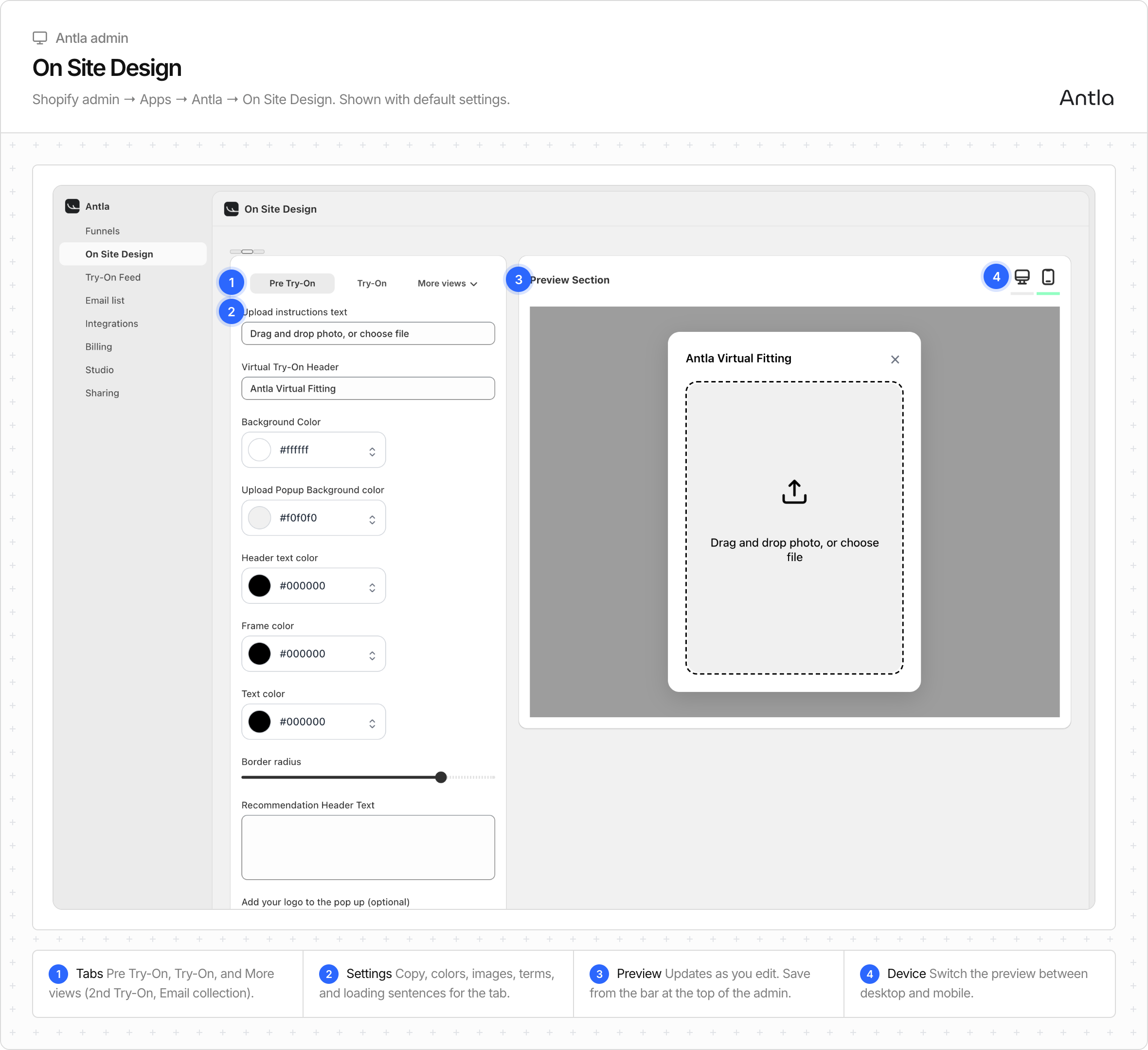
On Site Design has four tabs. On narrower screens, the last two sit under More views.
Pre Try-On: upload instructions, the modal header, colors, border radius, your logo, a background image, desktop width, terms and conditions or marketing consent text, and the loading sentences shoppers see while the look generates.
Try-On: whether the result becomes one of the product images, encouragement text, the result button (text, where it leads, colors, radius), the share text, and the try-on limit per shopper.
2nd Try-On: button text for returning shoppers who can reuse their last photo or upload a new one.
Email Collection: turn on email collection, choose which try-on asks for an email, and whether generation keeps running while the shopper fills in the form.
Keep the experience on-brand: one clear headline, short instructions, and visuals that match your product photography style.
Piece | Role |
|---|---|
Theme app embed ( | Turns Try On on for the theme |
Optional | Extra placeable control in the theme editor |
On Site Design | Look, feel, and on-site behavior settings |
The Headless SDK also reads On Site Design. Headless API does not. Your custom UI owns copy and layout in that case.
Enable the embed first on the Online Store. See Enable the Try On button (theme embed). Then refine On Site Design so shoppers see a polished flow.
Enable the embed on your live theme and confirm the button appears on a Funnel product.
Open On Site Design in Antla.
Align colors and key imagery with your storefront brand.
Write short, action-oriented copy (“Upload a full-body photo”, “See yourself in this look”).
Save and preview on mobile and desktop product pages.
Run one full try-on to confirm upload, waiting state, and result screen still feel clear.
One job: get the shopper to upload a good photo and generate.
Mobile first: most try-ons happen on phones—keep text short and buttons easy to tap.
Trust: avoid clutter; show that the photo is for try-on only in plain language if you collect emails later.
Consistency: match fonts and colors closely enough that Try On feels native to your PDP, not a foreign widget.
Avoid packing the first screen with promos, stats, or long legal walls. Put secondary actions (share, email, discount) after the result when your settings allow them.
Do not hunt for pop-up styling inside theme Liquid files—use On Site Design.
Do not disable the app embed while testing design changes, or the button will vanish.
Do not assume unpublished theme customizations appear on the live store—save and publish (or preview) the correct theme.
Review completed looks in Try-On Feed to see how real shoppers experience your Funnel. If upload quality is weak, pair design tweaks with clearer photo guidance—see Photo tips for best results.